I typically take ages to furnish a whole room, piece by piece. But now in the age of Amazon-prime, my one-click shopping trigger finger is finely tuned! I no longer need to see things in person. Instead, I just browse the interwebs in my pajamas, parse the online reviews, click buttons, and pray! It’s oddly liberating and slightly alarming. Usually with a glass of wine by my side because drinking and spending money is always a good combo right? With just a few clicks, voila: the first floor is furnished!
Prior to my shopping spree, the living room kind of looked like this:

This was in a post from 2015.
New stuff
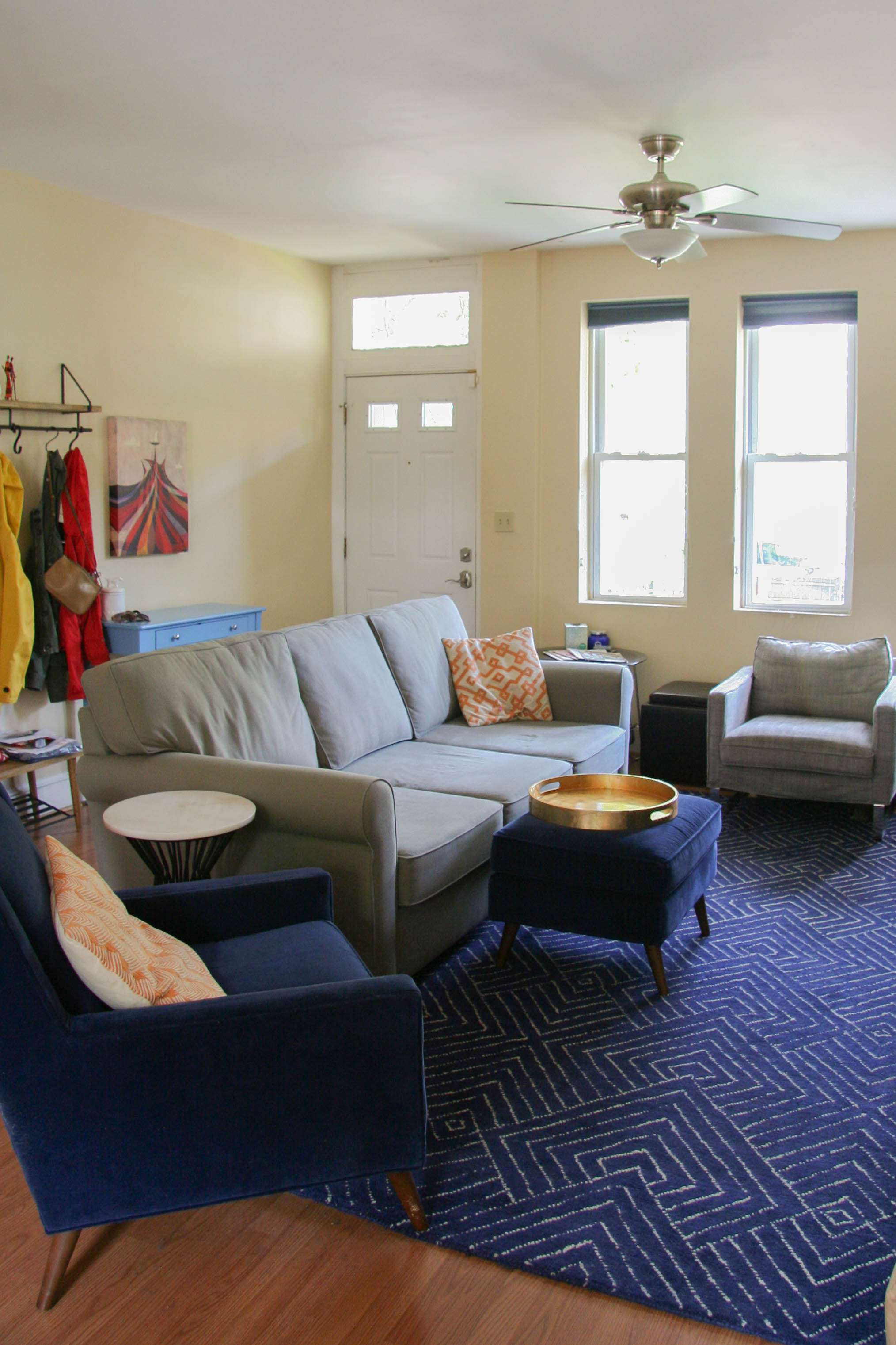
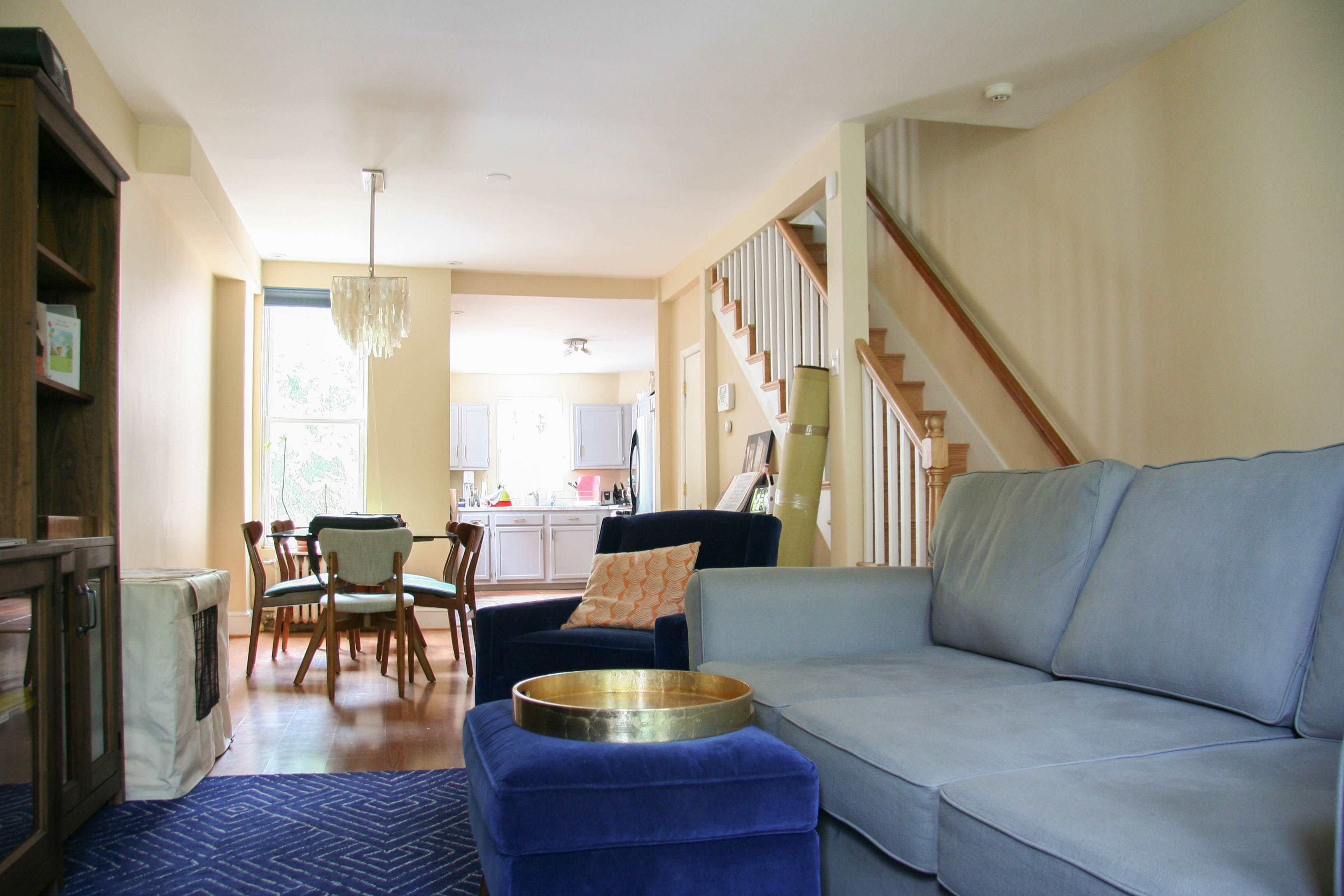
The rug: We needed a rug that was appropriately sized for the space. I figured out the right rug size through Pinterest. I knew I wanted one that had some geometric shapes and was rich in color to offset the neutral couch and walls. Found this beauty on AllModern and it was relatively inexpensive.
The couch: It’s from Pottery Barn. I wanted something big that I could really sink into. Mike wishes it wasn’t quite so deep but I think he will come around. It’s also sits 3 people much more comfortably than my compact condo couch.
The side table: From Wayfair. The marble is a nice contrast and it echoes the “fake granite” from the kitchen countertops.
We also are going to get rid of the leather cubes and will use the ottoman flexibly as a table with a lovely gold tray from West Elm.
Here’s what it looks like now:
We also recently went to Shenandoah National Park for a weekend and the cabin we stayed in had this adorable cushion. I love the Shenandoah and the colors of the letters are orange and blue which match our decor! It was only $20 so we bought one!

The dining table: I confess we may have had the dining table for a year or so and I never posted it. I wanted a glass table that was a lower profile because the space is so narrow. This one is from West Elm. Now we just need to buy some cool artwork for that very blank wall.
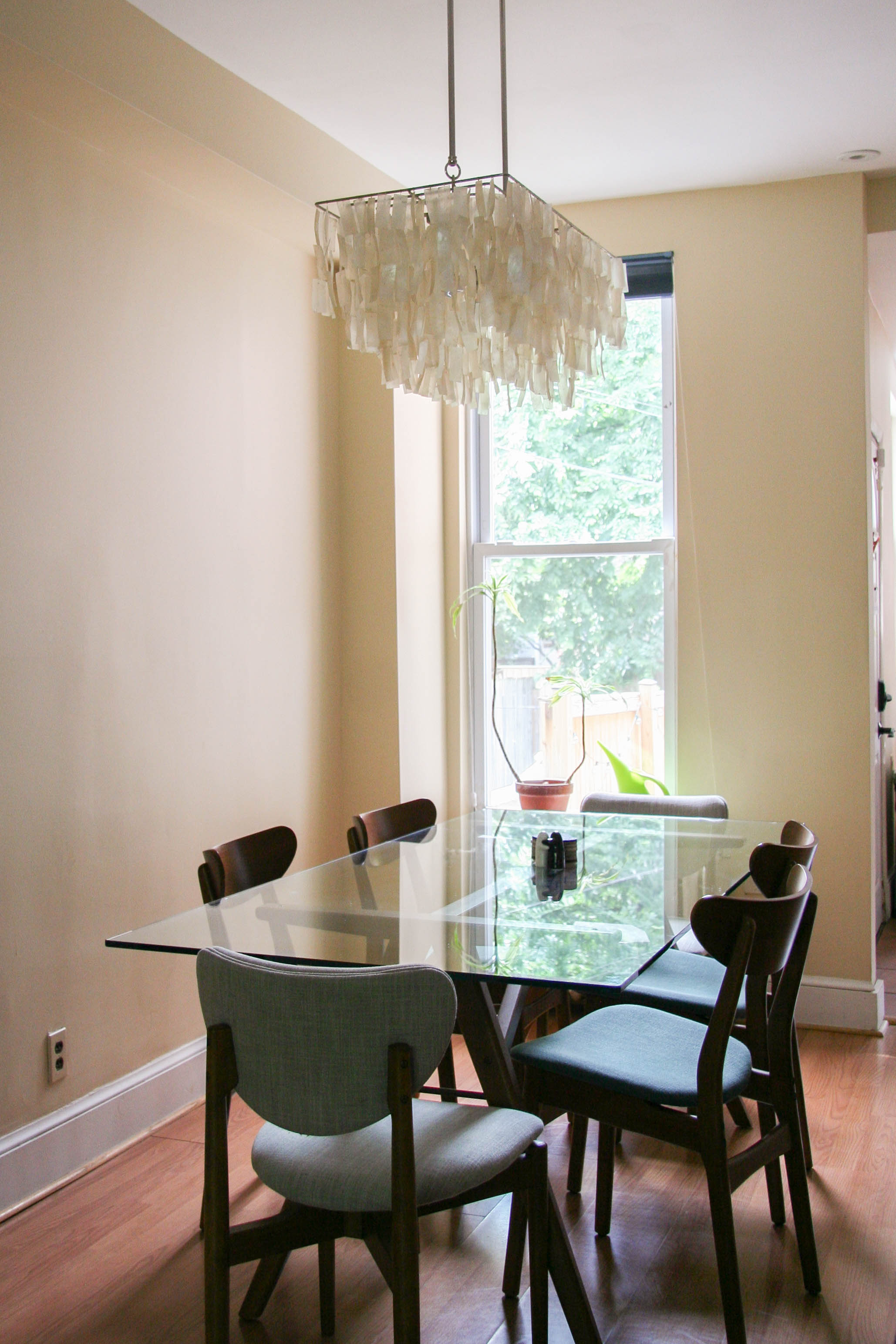
So now when we walk in the house, it actually looks coordinated and the kitchen doesn’t look terrible!
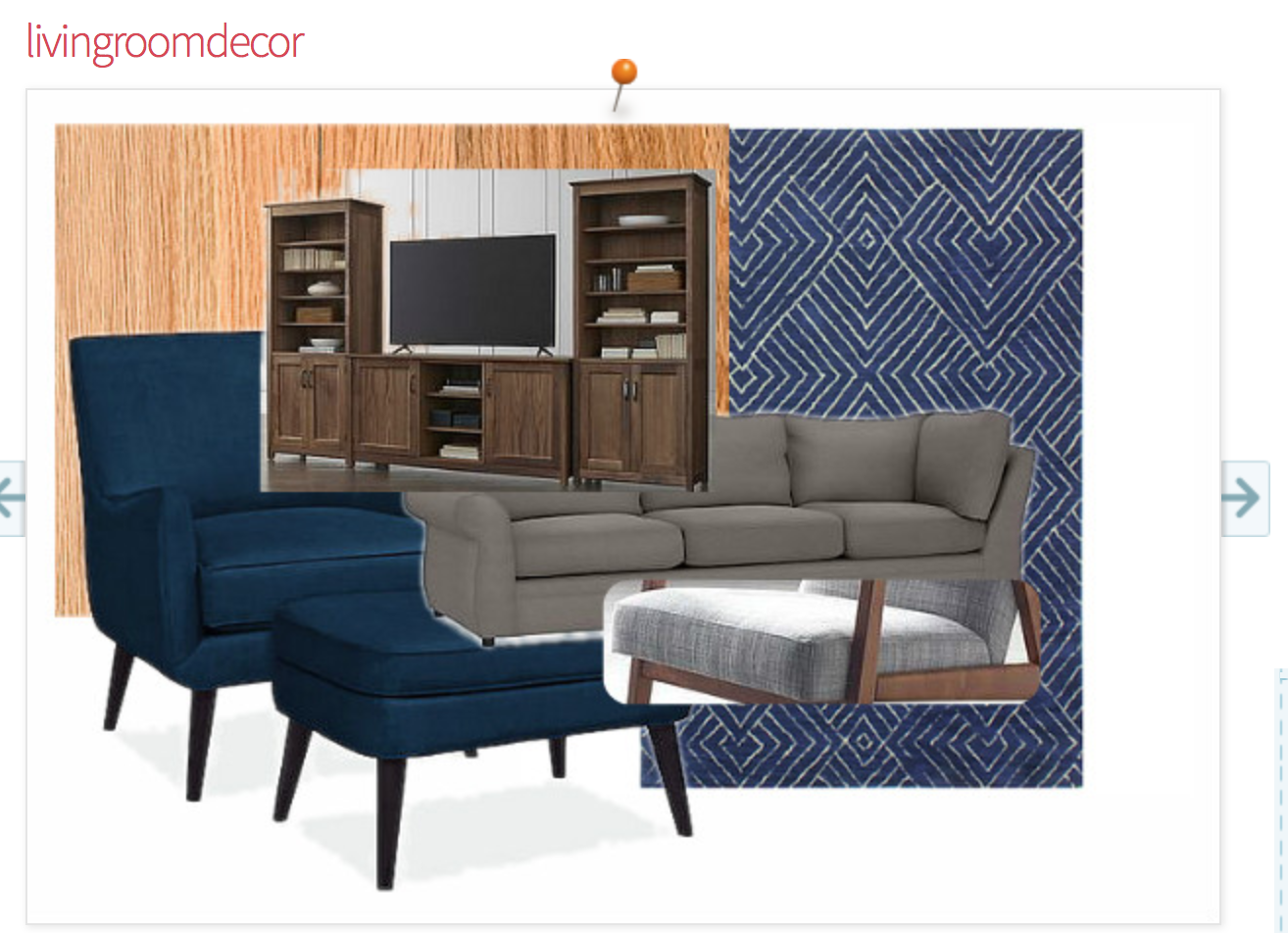
Digitally designing for a non-digital world
Not sure if this will be helpful for any of you but I use this online design board called Olioboard. It’s a little clunky but it’s free. It’s been handy for me, just to make sure the look in my head is going to translate in real life. I upload images of prospective items with everything I already own, before I purchase. This time around, it helped me avoid a rug disaster! I was originally planning on getting an orange rug to contrast the blue in the room but the Olioboard showed how much it would clash with our red oak floors and made me realize that it was way too much orange.
Here’s another example of how I picked the guest bath materials when we did the remodel in 2016:

I will combine it sometimes with Sherwin Williams Color Visualizer tool to pick paint colors. So for the master bedroom, I created an olioboard and then I uploaded it to Sherwin Williams like so:
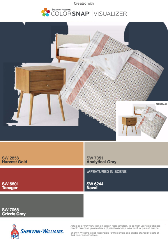
That’s how I selected the accent wall color and the duvet cover and got Mike to sign off on it all in advance!
And now…a puppy picture.
So I confess I actually bought all this stuff over the course of a few months. Here’s a pic of Thambi when we got the new rug. He is so FUZZY (because of his hair and also because I didn’t actually focus the camera in this pic, get it?!):

And then later on, he had a nice trim when the couch finally arrived:

That’s it for now, folks.